CREATED BY: Fabio Barbazza
DESCRIPTION:
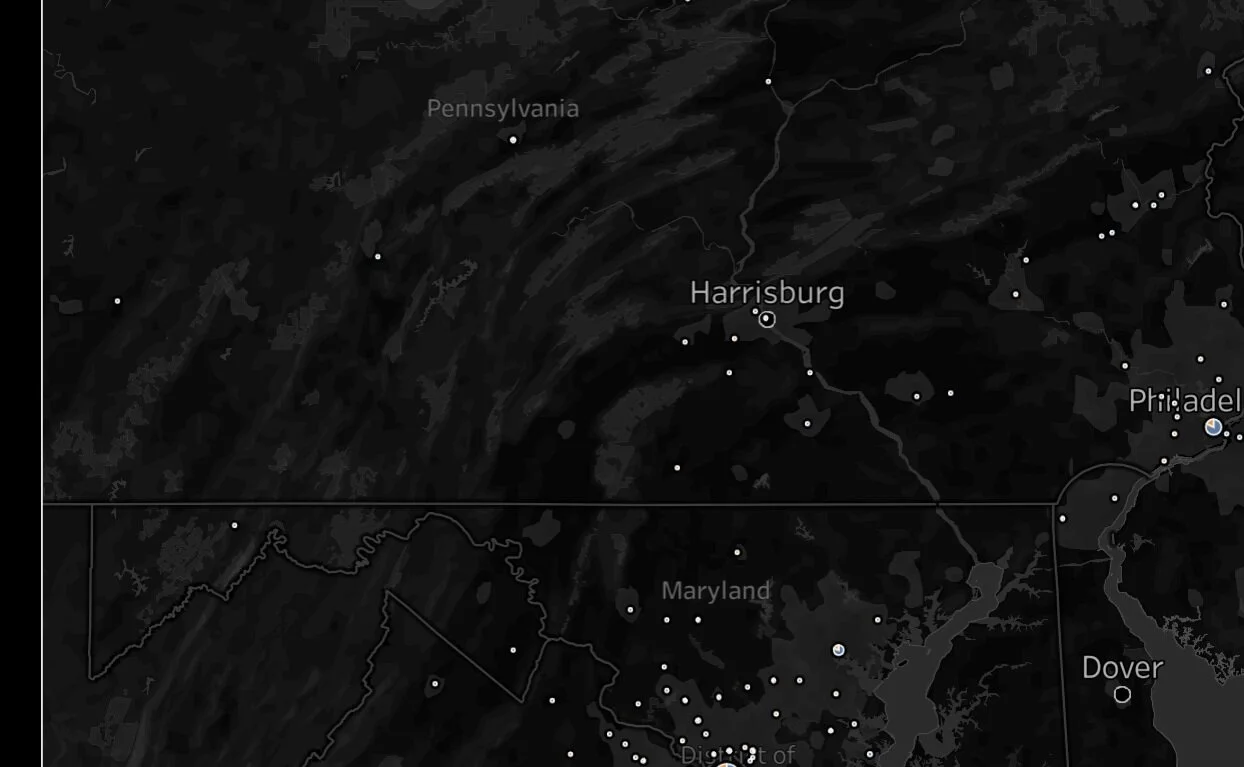
This tool describes how many subscribers have engaged the community all over the world. Each user was categorized using date of subscription : advanced/ principiant:
By clicking on each pie-chart it's easy to see the average value for each survey.
PROCESS:
Manipulating data using Python(pandas) to create subscriber category(how much time in the community).


