CREATED BY: Adam Korengold
DESCRIPTION:
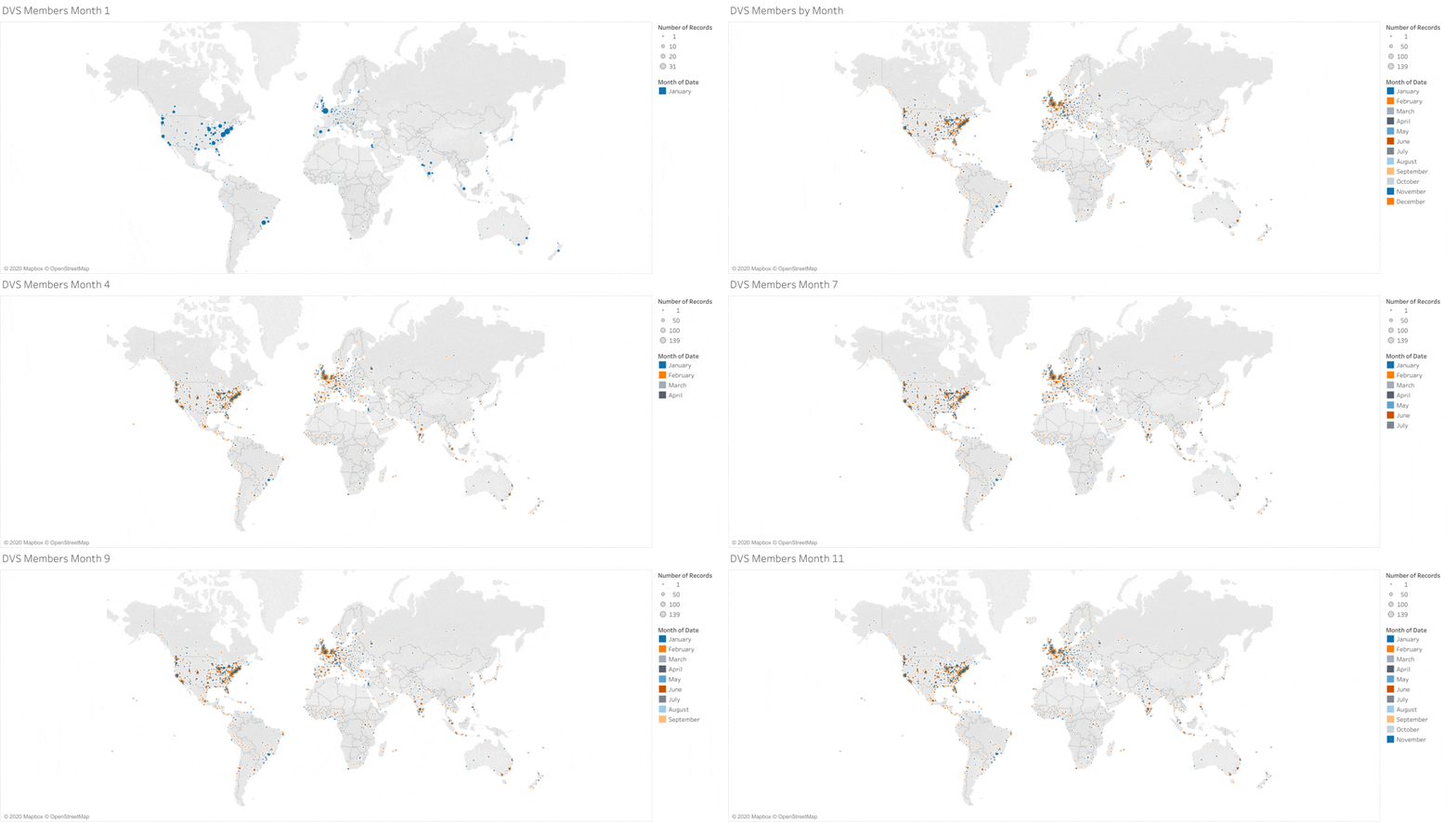
In its first year, the Data Visualization Society quickly achieved a global scope -- but there is room to grow, particularly in Africa, Asia, and Latin America.
PROCESS:
Using the Visualize the Membership data file from www.datavisualizationsociety.com, I loaded it in Excel format to Tableau Public. For each member, I assigned latitude and longitude to a world map to approximate the location of each member. I defined the size of each dot on the map as the number of records (e.g., members) for each location and assigned colors corresponding to each month, to define the number of new members joining during each of the first twelve months.
I created twelve worksheets to each month, progressively filtering for each month (e.g., one month for month one, the full data set for month 12) to develop twelve "cells" showing the expansion of the membership. I downloaded a static .gif file for each cell, and created an animated .gif showing the progression of the membership across the year.
The time series animation shows that the membership grew quickly in Europe and the coastal cities of the U.S., spreading progressively across Europe, the U.S. and India. While inroads are being made into Africa, East Asia, and Latin America, those areas remain less represented and are an opportunity for further growth of the global data visualization community.


