


Data Visualization State of the Industry 2025 Report
Executive Summary
The 2025 SOTI survey was disseminated online between December 17, 2025 and January 30, Distribution mechanisms included an email announcement and series of reminders from the official DVS email address, an announcement in Nightingale (the DVS publication), a series of posts on the DVS Slack, and numerous social media posts (e.g., X, LinkedIn) from DVS and others
(e.g., Meetup Groups).
As in previous years, our challenges with doing data visualization include not having enough time as well as technical limitations of tools, though there are many challenges that impact visualizers’ work. The theme of limited time also arises when considering what others don’t understand about data visualization work. We also struggle to explain the effort required to create a quality data visualization and that visualizations are not only meant for decoration.
Who are we?
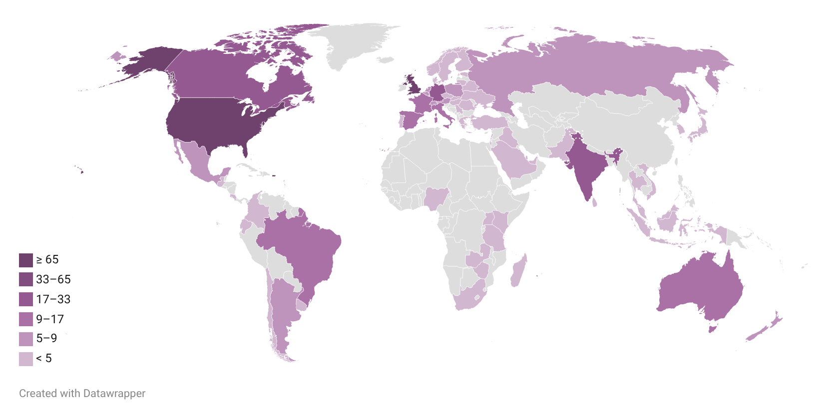
DVS 2025 SOTI survey respondents reported living in 63 countries, speaking 50 languages, and are a part of countless cultures from across the globe. We are men, women, and individuals who prefer to self-describe. Nearly three in ten of us identify as part of the LGBTQIA+ community or from a historically disadvantaged or underrepresented racial or ethnic group or both [Figure 1].
Figure 1. Maps of Survey Respondents (counts)
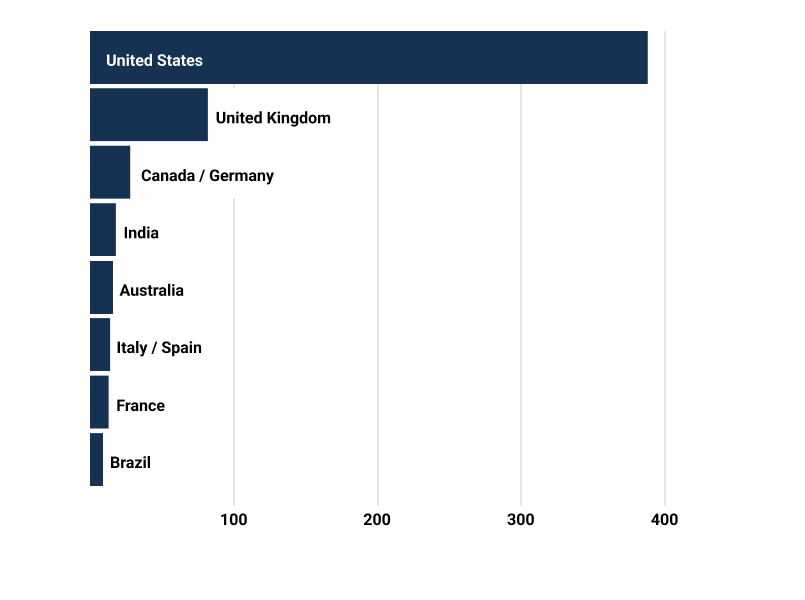
Across countries, most respondents were from the United States, the United Kingdom, and Canada, who have held the top three spots each year [Figure 2]. This year Germany tied Canada for the third most survey respondents. India, Australia, Italy and Spain (tied), France, and Brazil round out the top ten. The order of the countries with the fourth through tenth most respondents has fluctuated from 2024, with three of the 2024 top ten countries not in the 2025 top ten.
Figure 2. Rank of Countries by Total Respondents (counts)
In addition to location, data visualizers are also diverse in the languages they speak. Over 1 in 3 respondents who answered this question identified languages besides English, and we collectively listed 50 distinct languages [Figure 3]. Bubble size and color indicates the number of visualizers who identified speaking that language. The nine listed by the most respondents mostly match the past two years’ top listings: Spanish, French, and German, followed by Portuguese, Italian, Russian, and Hindi.
Figure 3. Non-English Languages Spoken by Data Visualizers (counts)
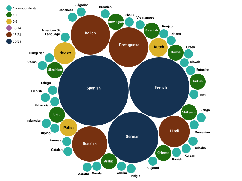
The number of distinct languages has been decreasing year over year, reflecting trends in fewer total survey responses. The proportion of respondents who identified speaking a language other than English increased slightly to 40%, up from 37% in the 2023 and 2024 surveys.
Survey respondents represent many different backgrounds, experiences, and perspectives. Of the 619 respondents who answered the question about gender, 48.5% identified as women, 47.7% identified as men, and 3.9% preferred to self-describe or preferred not to say, similar proportions to the 2024 survey. The survey also collected information on whether respondents identified as LGBTQIA+ and if they considered themselves a part of a historically disadvantaged or underrepresented racial or ethnic group; 28.3% identified as part of one or both groups , an increase from 2024 [Figure 4].
Figure 4. Respondents Identifying as LGBTQ+ or from a Historically Disadvantaged or Underrepresented Racial or Ethnic Group (percent of respondents)
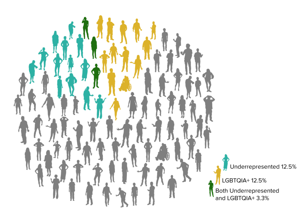
Among the 21 respondents who self-described their underrepresented group, most mentioned groups in the United States and a few identified as part of groups around the globe. Shape, size, action, or wheelchair status of icons are not meant to reflect survey respondents but included to demonstrate diversity in data visualizers.
Who are we?
DVS 2025 SOTI survey respondents reported living in 63 countries, speaking 50 languages, and are a part of countless cultures from across the globe. We are men, women, and individuals who prefer to self-describe. Nearly three in ten of us identify as part of the LGBTQIA+ community or from a historically disadvantaged or underrepresented racial or ethnic group or both.
What roles do we occupy and in what contexts do we work?
The 2025 survey received 725 responses to its opening question on data visualizer roles.
While some things about the way we work hasn’t changed that much in the past few years, the overall share of
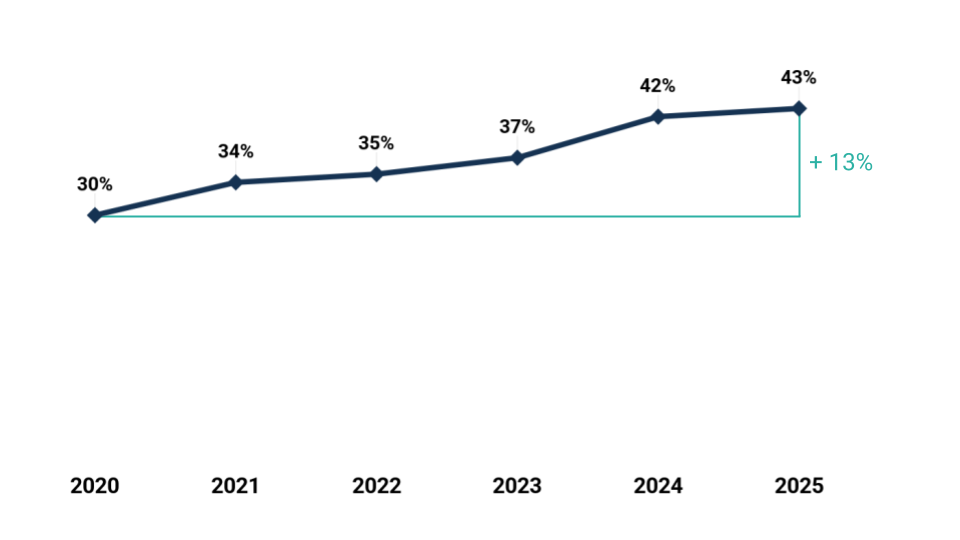
respondents who identify data visualization as their primary focus has increased each year starting at 30% in 2020 and now at 43% this year.
Figure 5. Data Visualization as a primary focus (percents)
Echoing the past four years’ surveys, the roles question listed six options: four paid capacities plus two unpaid. The answers from 2025 indicate an increase in respondents working in freelance roles. As Figure 6 shows, the two most frequently represented—Employee (“Position in an organization”) and Freelance (“/Consultant/Independent contractor”)—were chosen by 7 in 10 and 1 in 4 data visualizers respectively.
Figure 6. Data Visualization in Mostly Paid Capacities (percents and counts)
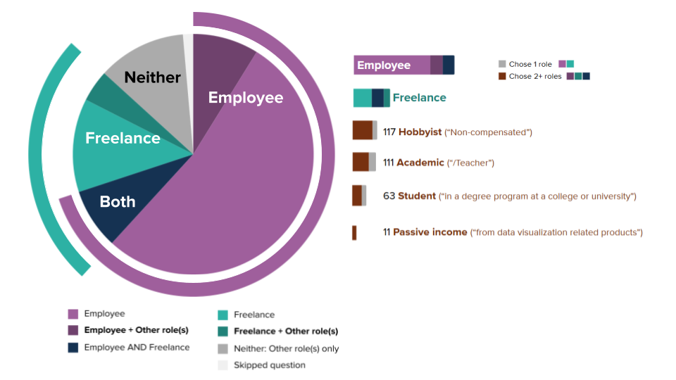
Just over 7% of respondents indicated that they do data visualization exclusively in unpaid capacities (as a Hobbyist and/or Student). This total is similar to the 6–8% of respondents who reported doing data visualization in other capacities in DVS State of the Industry Surveys dating back to 2020.
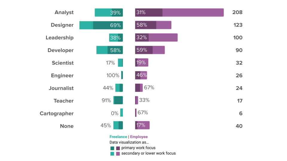
Respondents who chose Employee or Freelance were asked which of nine roles most closely aligns with their job and whether data visualization constitutes the primary focus of their work, an important secondary part, or neither. Figure 7 shows substantial variation by role type and some variation by employment context. Designers, Developers, Journalists, and Freelance Engineers and Teachers most often do data visualization as their primary focus. Among Analysts (the largest group, with over 200 respondents), around one-third focus primarily on data visualization.
Figure 7. Primacy of Data Visualization by Role Type (percents)
The job titles that correspond to each role include data scientists, analysts, academics, and researchers; graphic designers, data storytellers, journalists, reporters, cartographers, architects, biologists, engineers specializing in machine learning, business intelligence, and software, and developers with experience on the frontend, with software, and for data visualization. We also heard from leaders at all levels, including team leads, managers, those of senior status, presidents, directors, chiefs, and founders. Notably, 37% of respondents indicated a job title containing the word “data,” 26% held a job whose title contained “analyst,” “analytics,” or “analysis,” and 16% reported a job title with some form of “visual” in the name (e.g., visualizer, visualization). Just over 20% had titles related to “research” or “design,” an increase from 2024, and 10% were related to “developer” or “engineer.”
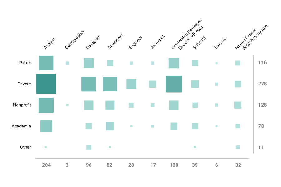
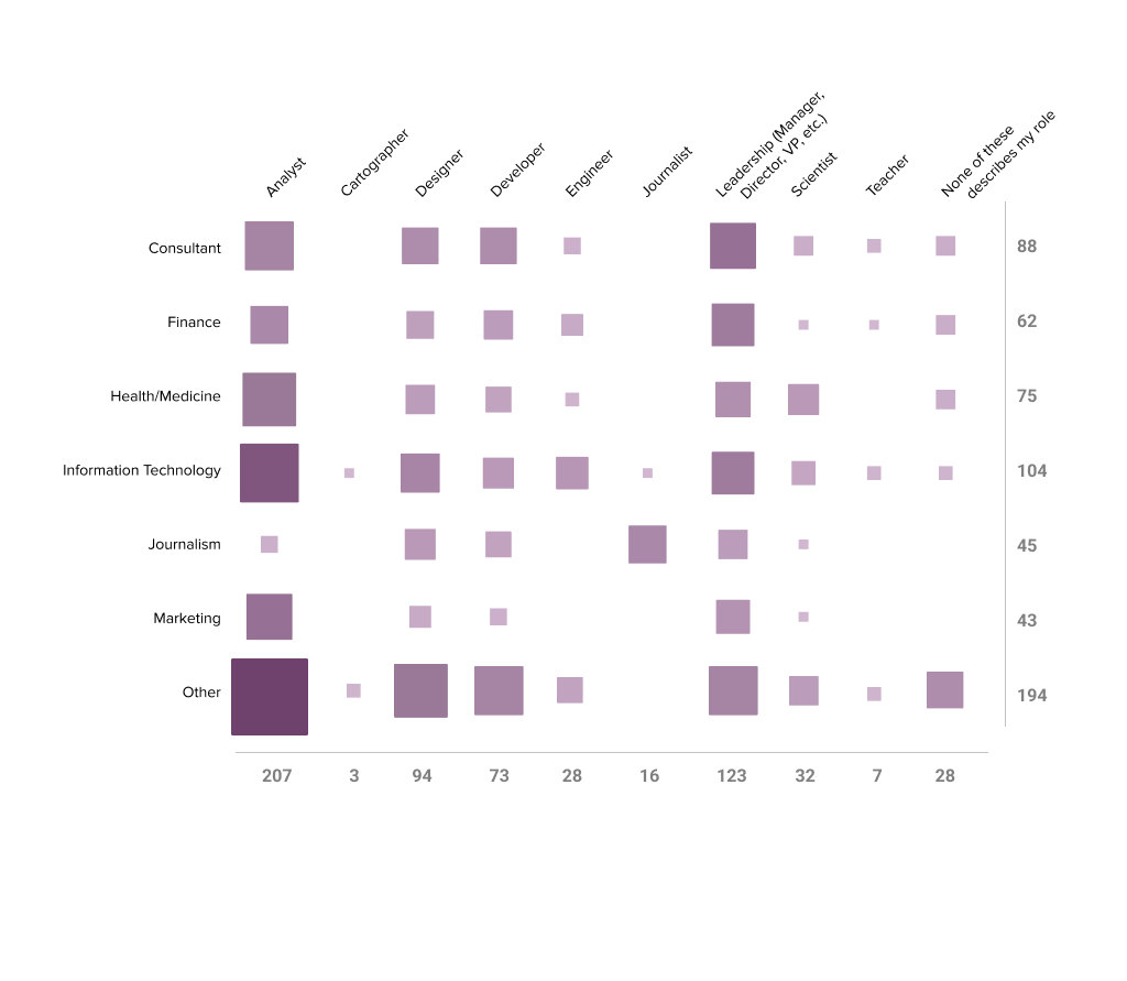
Respondents who chose Employee (“Position in an organization”) were also asked about the context (sectors and industries) of their organizations. Figure 8 shows how role types intersect with their identified organizational sector (top) and industry (bottom). Box size corresponds to the number of respondents at a given intersection. Analysts and folks in leadership roles are well represented across sectors and industries. There is relatively even distribution across industry categories included in the survey, but notably many respondents identified their industry as “Other” suggesting a breadth of industries to explore further.
Figure 8. Data Visualizer Roles by Sector and Industry (counts)
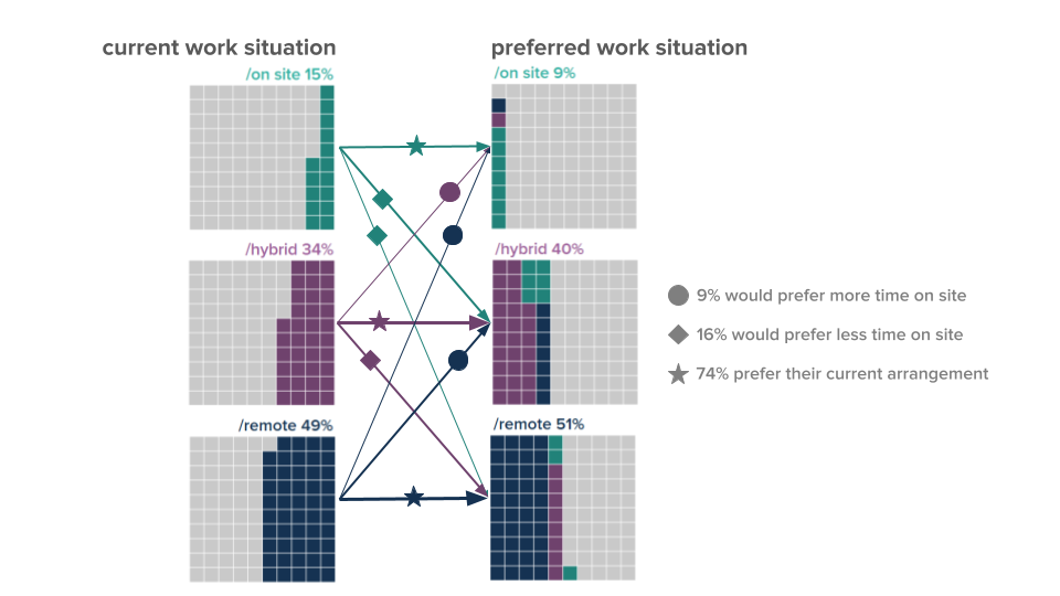
Knowing that where and how we work has changed since the COVID-19 pandemic, and shifted again with back-to-work orders, we continue to track the situation data visualizers find themselves in and whether or not they are happy with their current work arrangement – be it on site, remote, or a mix of the two. Half (49%) of survey respondents who answered a question about employment told us they are currently working remotely; 15% are working onsite, an increase since 2024, and 35% have hybrid work arrangements. While 74% told us that they like their current work arrangement (whatever it may be), 9% would prefer more opportunities to interact regularly with colleagues in-person, and 16% would prefer less. This has remained fairly consistent since we first asked in 2022 although the number saying they’d prefer less time on site has increased slightly each year since 2023.
Figure 9. Current and Preferred Work Arrangements (percents)
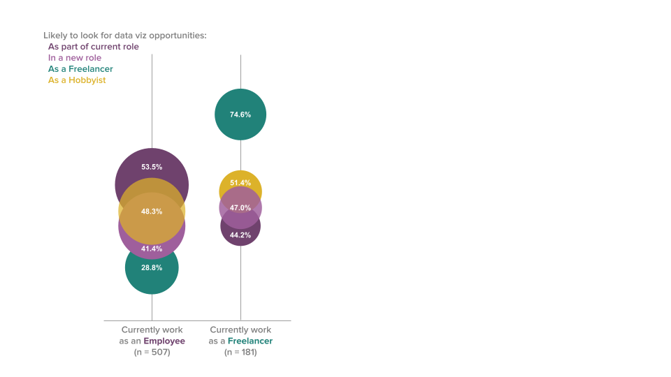
While the desire for a new working arrangement is relatively low, respondents reported wanting to find new opportunities to do data visualization [Figure 10]. Just over half of employees (54%) are likely to seek out data visualization opportunities as part of their current role, as are 44% of Freelancers (75% of Freelancers want more Freelance data visualization in general). And while 4 in 10 employees (41%) and slightly more freelancers (47%) are interested in a new role at an organization, this road to more experience isn’t as appealing as gaining more data visualization experience as a hobbyist (48% of employees and 51% of freelancers).
Figure 10. Likelihood to Seek New Data Visualization Opportunities (percents)
What roles do we occupy and in what contexts do we work?
Each year of the survey we ask how many years of data visualization experience respondents have. The ridgeline plot in Figure 11 shows the increases in the proportion of more seasoned data visualizers over time. The highest proportion of respondents remains the same as in prior years: between six and ten years of data visualization experience.
How do we spend our time and how much do we make?
Respondents to the 2025 DVS SOTI survey represent a diverse array of fields, including the public sector, non-profits, academia, and freelance/consulting roles. Our job titles reflect the wide-ranging nature of our daily responsibilities and highlight the presence of data visualizers at all leadership levels. We work as analysts, designers, and developers across public, private, and non-profit organizations, spanning industries such as finance, marketing, and IT. Over the past few years, many have transitioned to a new way of working, and we are looking to integrate more data visualization work into our roles.
Figure 11. Years of Data Visualization Experience over Time (percents)
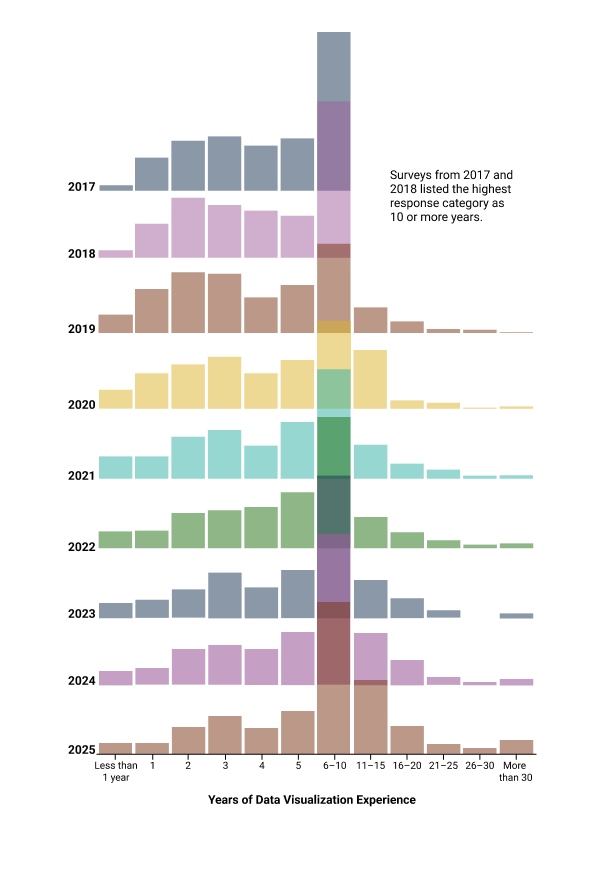
In the 2025 survey, we see proportionally fewer folks in their first few years of data visualization. This may suggest that interest in data visualization may be waning. We also notice more folks in the higher years of experience categories, which makes sense as we have similar segments of visualizers responding to this survey each year. Looking at the changing distributions of data visualizers can help us understand what types of resources might be helpful. For example, a seasoned data visualizer may need different support than someone relatively new to the field, and vice versa.
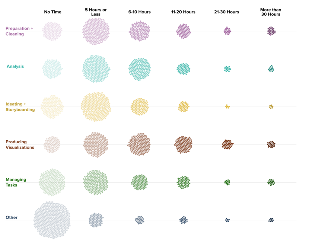
A key aspect of understanding someone’s data visualization practice is how much time they dedicate to different tasks. The beeswarm plot in Figure 12 highlights some of these activities. Most visualizers spend fewer than ten hours per week on any single task, often with little to no time on data visualization management. Respondents reported spending the most time producing visualizations; it has the highest proportion of participants spending 11 hours or more on the task, the same pattern we have seen since 2023. In general, folks don’t report spending more than 30 hours per week on a given data visualization task, but for those who do, those hours are most often spent preparing and cleaning or producing data visualizations. Tracking and documenting how we spend our time is valuable to normalizing workflows and understanding what it takes to create high-quality visualizations.
Figure 12. Hours Spent on Data and Visualization Tasks (counts)
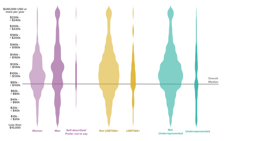
Similarly, transparency around compensation can help professionals establish their rates and advocate for what their time is worth. The overall median of the reported annual compensation [Figure 13a] is $80,000 to $99,999 (US dollars) per year, maintaining the salaries of respondents from 2023 and 2024. Just over 5% of the 546 respondents who reported an annual salary indicated making $200,000 or above. Respondents who identified as men reported an annual salary in the $100,000 to $119,999 range; those who identified as a part of one or more disadvantaged or underrepresented racial or ethnic groups reported an annual salary in the $60,000 to $79,999 range.
Figure 13a. Annual Compensation by Gender, LGBTQIA+ Status, and Historically Disadvantaged or Underrepresented Racial or Ethnic Group (counts)
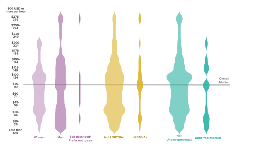
The data for hourly compensation in Figure 13b are similar in that very few folks are represented in the higher categories, though there are fewer respondents and a bit more variation across identity groups. The overall median hourly rate is $60 to $74 (US dollars) per hour. The median hourly compensation for women and those who preferred to self describe is between $45 to $59 and $60 to $79 per hour while those who identified as men were between $60 to $79 and $80 to $99 per hour. Men, those who do not identify as LGBTQIA+, and those who do not identify as from an underrepresented racial or ethnic group are most represented in the higher rate categories.
Figure 13b. Hourly Compensation by Gender, LGBTQIA+ Status, and Historically Disadvantaged or Underrepresented Racial or Ethnic Group (counts)
How do we spend our time and how much do we make?
Since the first State of the Industry survey in 2017, our community is becoming increasingly more seasoned. Most of us report cleaning data and producing visualizations for at least some time in the past week, these are also the data visualization tasks on which the most folks reported spending more than 30 hours. Collectively, we earn a median annual pay of USD $80,000–99,999 or an hourly rate of USD $60–74, continuing the trend from 2024. Visualizers identifying as a woman, self-identifying their gender, community, or as part of a historically underrepresented group reported lower median hourly compensation.
How do we visualize and what challenges do we face?
In our State of the Industry Survey we ask many questions about how we visualize, including what tools respondents in particular roles or work contexts use, which chart types we use the most, and how we share our visualizations. Not all of them are answered in detail in this report; here we paint a broad picture of which technologies are used most for data visualization (Figure 14) and how much we enjoy the tools we use most often (Figure 15), leaving additional deep-dives to the community.
During each of the seven years that the Data Visualization Society has conducted this survey,6 the tool used by the largest share of the respondents has been Microsoft Excel.
Figure 14. Technologies Most Used 2019 to 2024 (percents)
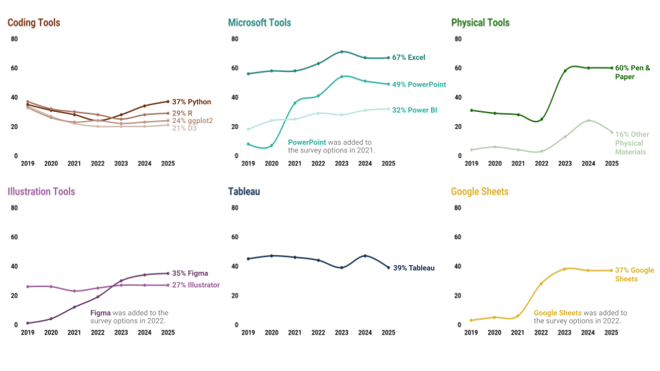
In contrast to past years, 2023 onwards asked about tool usage with a frequency grid—offering “Often”, “Sometimes”, “Rarely”, and “Never” for each entry—instead of just a checklist. Figure 14 shows the top entries where respondents chose “Often” or “Sometimes”.7 As a whole, the results stay consistent from 2023 to 2025, with a few exceptions. Use of Tableau (-9%) and other physical materials (-8%) both decreased from 2024.
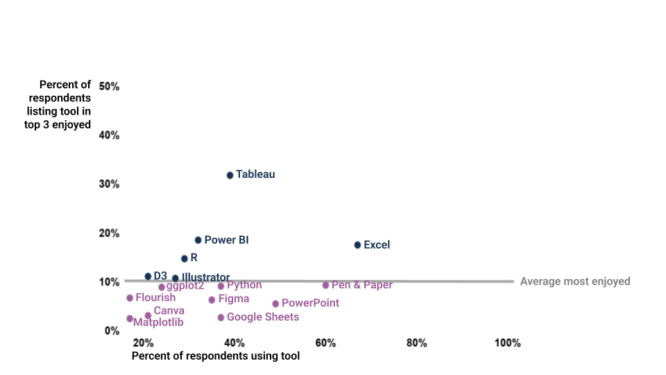
This was the third year the survey asked data visualizers how much they like the tools they use. Figure 15 displays how much data visualizers enjoy using specific tools relative to how extensively they are used. Each dot in the scatterplot represents one of 19 unique tools, combining the top 15 tools used most frequently and the top 15 tools enjoyed most, as reported by the 816 practitioners who responded to the tools questions.
Tools enjoyed at or above average (i.e., noted by at least 10% of the data visualizers who listed their three favorites) are represented in dark blue, while those falling below this average are indicated in plum. The preferences expressed by 2025 survey respondents are as follows:
○ Tableau is listed as a favorite for a third year in a row by 32% of respondents.
6 Beginning with the founding of the DVS in 2019. Comparisons with 2017–2019 are available in the 2021 and 2023 DVS survey reports. Figure 14 shows this year and the prior five years of tool use.
7 Focusing on “Often” + “Sometimes” provides the closest percent matches with responses to previous surveys’ checklist question.
○ The next three favorites: Power BI (enjoyed by 18%), Excel (17%), and R (15%). ○ Rounding out the list of tools that ranked high for both frequency and enjoyment are: D3.js (11%), and Adobe Illustrator (11%).
Figure 15. Enjoyment of Technologies Most Used in 2025 (percents)
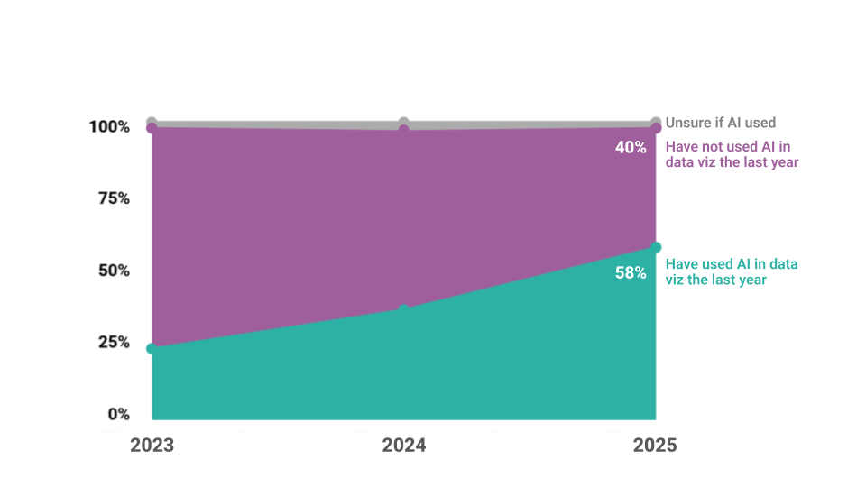
Artificial Intelligence (AI) technology is shifting much of how we work, including within the field of data visualization. This is the second year the survey asked data visualizers if they’ve used AI in their data visualization work in the past year (Figure 16). This year:
- 40% did not use AI in their data visualization work, decreasing by 20 percentage points compared with 2024.
- 58% used AI in their data visualization work, increasing by 21 percentage points compared with 2024.
- 2% were not sure if they used AI in their data visualization work, decreasing by 1 percentage point compared with 2024.
Figure 16. Increasing Use of Artificial Intelligence (percents)
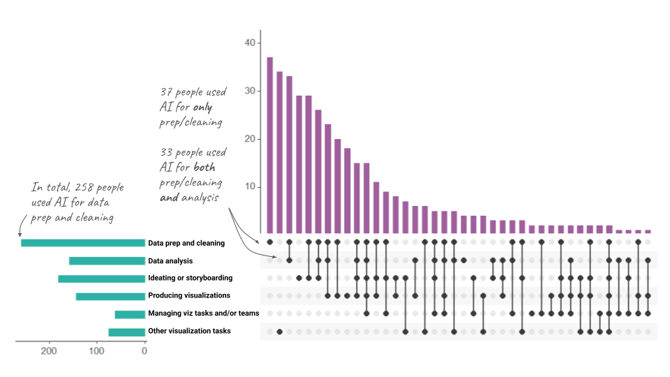
Among the 397 people who reported using AI in their data visualization work, the findings showed that the majority of respondents used AI primarily during the initial stages of the data lifecycle. As Figure 17 illustrates, most participants reported using AI for data prep only (37 people), other tasks only (34 people), or data prep
Of the respondents who selected “Other visualization tasks,” 75 provided write-in responses detailing their use of AI tools. Thematic analysis revealed four key themes: 1) coding assistance, 2) learning and skill building, 3) brainstorming, 4) writing and communication, including review of content, and 5) accessibility. Most of the write-in responses highlighted using AI for coding-related tasks, such as debugging and generating code, with one participant stating, “Help with tools outside my core skillset (ie CSS, React, Docusaurus) and with complex maths functions.” Other respondents used AI for the content of the visualization itself, with a respondent noting they use AI when they are “Writing titles, descriptions, alt text; finding relevant data sources or further potential question on a specific topic.” These findings illustrate the diverse applications of AI in visualization workflows and the integration of AI into the toolkit of data visualizers across the data visualization development lifecycle.
Figure 17. Use of Artificial Intelligence by Data Visualization Task (counts)
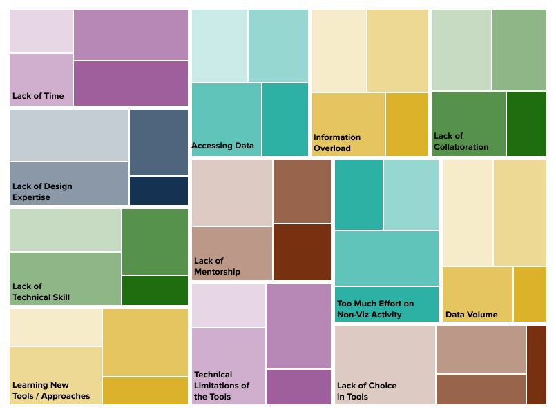
Respondents indicated what challenges they face when doing data visualization [Figure 18]. The most common challenge was lack of time, selected by 84% of visualizers who responded to this question. Technical limitations of tools (81%), too much effort on non-viz activity (80%), and learning new tools/technologies (79%) were the next most commonly selected responses; technical limitations of the tools was not as big of a challenge in prior years. Across all of the challenges, lack of time (30%), too much effort on non-viz activity (22%), and accessing data (20%) were rated as the most significant challenges, the same top significant challenges as 2023 and 2024.
Figure 18. Top Challenges with Doing Data Visualization (counts)
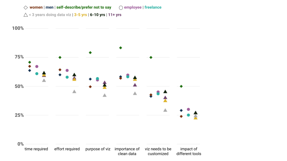
Those working in data visualization all have frustrations about what others do not understand when it comes to data visualization [Figure 19]. First and foremost, around two-thirds of respondents say it’s hard for non-practitioners to understand the time (65%) and effort (62%) required to complete a visualization from start-to-finish. Another half believe it’s hard for those they work with to understand the importance of clean data (58%) and they don’t understand that visualizations are more than just decoration (55%). Relatively few feel that the impact of different tools on visualizations is difficult for others to understand (28%). While these frustrations are consistent across years and relatively common across all groups, there are some differences based on gender, whether you’re working as an employee or freelancer, and how long you’ve been working in data visualization.
Figure 19. What’s hard to understand about data visualization work (percents)
How do we visualize and what challenges do we face?
DVS 2025 SOTI survey respondents use a lot of different tools to accomplish our data visualization tasks. Across the past 6 years, Excel, Tableau, R/ggplot, and PowerPoint have been some of the most popular tools, though respondents report dozens of unique tools annually. Dashboard and spreadsheet tools tend to be the most liked; Microsoft tools tend to be the most used. We are incorporating AI into most aspects of our data visualization workflow, primarily applying AI early data lifecycle stages, such as data preparation, cleaning, and analysis, with some folks using AI to code, ideate, and learn. As in previous years, our challenges with doing data visualization include not having enough time as well as technical limitations of tools, though there are many challenges that impact visualizers’ work. The theme of limited time also arises when considering what others don’t understand about data visualization work. We also struggle to explain the effort required to create a quality data visualization and that visualizations are not only meant for decoration.
How do we get better?
Perhaps due to the intersectionality of data visualization, or the evolving availability of technologies, it seems like we always have something new to learn. Each year the survey includes questions to understand our preferred methods of learning, priorities for improvement, and use of professional development funds related to data visualization.
To learn new data visualization skills, respondents collectively reported that it is most useful to “Work through a project” (82%) and engage with “Examples” (62%). As Figure 20 indicates, these two approaches have consistently topped the list through seven annual surveys.
Figure 20. Helpful Methods for Learning New Data Visualization Skills
(percents)
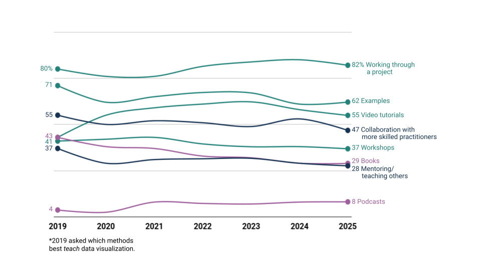
By contrast, “Books” continues to decrease in popularity and has dropped 14% points since 2019 when it was tied with “Video tutorials”. “Video tutorials” have increased in popularity over time, reaching a peak in 2023. As in previous years, the relatively low ranking of “Workshops” on this list stands in striking contrast to their #1 position in Figure 23 on how data visualizers are likely to use professional development funds.
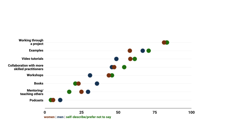
While visualizers continue to prefer “Working through a project” above all else, there are some interesting differences when we explore the rest of the data in Figure 21. Folks who self-described their gender preferred all forms of learning except for books, mentoring others, and podcasts. Women were less enthusiastic about working through examples or using books to learn in 2025 while men remained consistent in their preferences between 2024 and 2025.
Figure 21. Data Visualization Learning Preferences by Gender (percents)
The most frequent write-in responses for “Other” this year are AI as a learning partner (over one-third of responses), blogs and written tutorials, and online courses. For example, one respondent said they learn via “Paired programming with AI; online bootcamp-style courses.” A few folks also mentioned finding inspiration for their next learning topics “Sometimes skimming other’s portfolio will inspire me to try something new, ie ‘why didn’t I think of doing that?!’”
Similar to 2023 and 2024, almost all (94%) respondents wanted to improve their skills. When asked to pick one next priority, learning a new tool was the top response (28%). Improving use of a tool came next (26%), followed by design (21%) and data skills (13%). Other topics (6%) included AI use, UX/UI skills, and application of data visualization in research and decision-making. Only 6% of respondents didn’t feel the need to improve their data visualization skills.
Figure 22. In Person or Virtual Training for Data Visualization (percents)
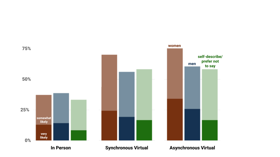
Responses indicated that many more data visualizers think it likely that they’ll attend training virtually (around two-thirds) than in person (just over one-third). The difference between synchronous and asynchronous virtual options, by contrast, is fairly small (a difference of 4%). Comparing responses by gender in Figure 22 suggests that women are more likely than men or respondents who preferred to self-describe their gender to attend virtual training. Everyone was equally unlikely to attend in-person training.
Skill building and development can also be facilitated through professional development opportunities and funding. Fewer than half (47%) of the 2025 survey respondents reported having access to at least $1 in professional development funds (down from 58% in 2024). Another 18% have $0 but still have professional development plans.
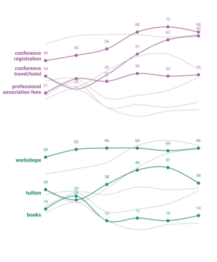
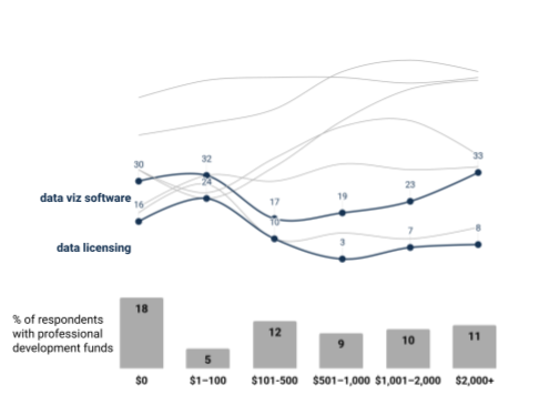
Figure 23. Plans for Professional Development Funds Depending on Budget (percents)
Figure 23 shows the different events, activities, or other costs they would likely cover using professional development funds depending on how much they anticipate being allocated in 2025; respondents could select all activities or resources for which they would consider using funds. The type of activity survey respondents are interested in is dependent on how much they have to spend, but priorities remain the same as last year. Not surprisingly, those with more to spend are still more likely to budget for conference registration and travel/hotel. Books, software, and licensing, on the other hand, are most popular with those with less than $100 to spend. Workshops are universally of interest.
How do we get better?
Data visualizers use a variety of approaches to build our skills. As in the past four years, our top skill development priorities focus on mastering tools and design. Many of us prefer hands-on learning through projects but also engage with other methods such as video tutorials, workshops, and AI support. Virtual training remains a popular option for skill-building. When it comes to professional development funds, our priorities for professional development funds vary depending on expected budgets, though conferences and workshops top the list.
What do the data tell us about the future of the industry?
Each year we try to think about what the future holds for data visualizers. When asked whether or not interest in data visualization is increasing or decreasing, just over half believe it’s increasing (53%) and only 10% believe interest is waning. This represents a shift from 2024 where 10% more respondents thought data visualization interest was increasing.
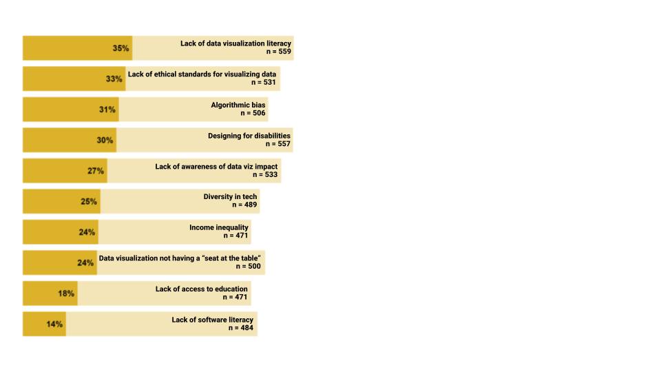
Visualizers also acknowledge issues surrounding data visualization within the community and beyond (Figure 24). The top three issues that were rated as “extremely urgent” were lack of data visualization literacy, lack of ethical standards for visualizing data, and algorithmic bias. These issues, along with designing for disabilities, have been at the top since 2023. In 2021 and 2022, respondents indicated the lack of data visualization literacy, the lack of awareness of the impact of data visualization, and data visualization not having a seat at the table as key issues. These year over year differences might indicate a shift in concern to the biases inherent in AI, which more people are using for data visualization.
Figure 24. Top Issues Facing Data Visualization and Ratings of Urgency (percents and counts)
What do the data tell us about the future of the industry?
The top issues facing the data visualization community continue to shift across years, with lack of data visualization literacy, lack of ethical standards for visualizing data, algorithmic bias, and designing disabilities receiving the most ratings of extreme urgency to address. Further, about half of us believe interest in data visualization is increasing.
Acknowledgements
The DVS Survey Committee, members of which thoroughly review and refine the survey items each year and compile this report, includes experts on data visualization, survey design, program evaluation, research, and consulting, among others.